Transforming research studies into valuable insights
My Role
Lead UX Designer
Timeline
4 weeks
Team
1 UX Designers
1 Researcher
1 Content Designer
1 Developer
My contributions
Ideation
Prototyping
Context
I helped to redesign the IBM User Insights Hub, an internal platform that allows UX Researchers share insights and track impact.
The tool was being used across different area of the business (IBM Cloud, IBM Security, etc) with the goal of also increasing adoption use by researchers.
THE SOLUTION
Gain powerful insights
With researchers and product managers generating a lot of information + data from their work, it becomes a challenge to house all of that in a trackable way. I worked with the other designer to create a more organized view.
The contents of the UIH library are not easy to consume.
So how might we redesign the current library to make this information more consistent, concise, and easy to scan?
RESEARCH
They didn’t like it
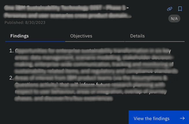
Our researcher on the team held a workshop with some of the project managers and researchers (our primary user group), and I was able to acquire a few of the challenges that our users were running into, which were leading to lower adoption rates. (*Confidential information has been blurred out*)
"The text is SO dense, it's hard to read"
"Not sure about the hierarchy or relationship between these headers?"
"This doesn't feel like I can really easily scan the card"
DEFINE
3 key pieces to the goal
After diving a little more into the workshop findings, I identified some of the pieces that we wanted to tackle in our redesign.
Creating readability + hierarchy
Forming a more clean layout
Filling in content gaps
IDEATION
Gotta start with Crazy 8’s (or 3’s)
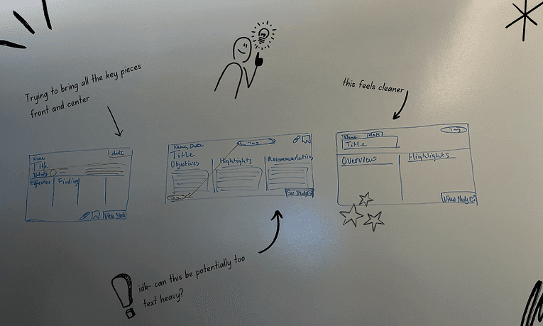
Based on the findings provided by the team, Leo and I sat down to explore designs using crazy 8’s. Initially we tried to fit everything on one frame, and soon came to realize: real estate was limited, and precious.
I created multiple versions
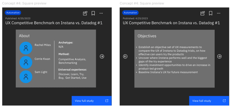
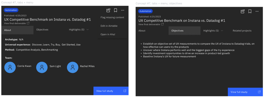
After some rough sketches, I designed a few different approaches while still using the "card" look and feel.
Space was our main challenge
Although we weren't able to conduct usability tests, the biggest pieces of feedback from our stakeholders came down to one thing: space.
If there were additional researchers, or findings etc.,
how would the card account for all this information?
FINAL SCREENS
Surface the key parts to the front
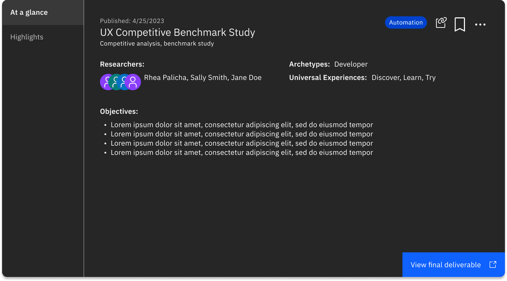
Based on stakeholder feedback, we wanted to surface the key details to the cover/face of the card, allowing the user to quickly scan high level pieces of the research study (the who, what, and how)
Make it simple to scan
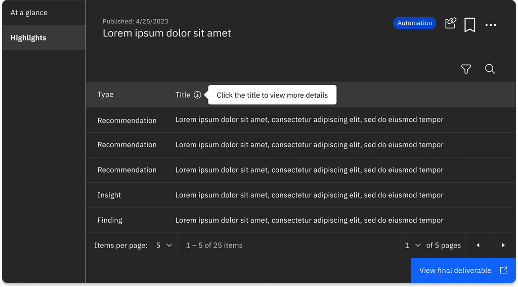
When we saw how many research outputs there were, we determined that a table format was our best solution, creating a clean way for the user to search and filter findings accordingly.
LEARNINGS
I’m not the user, and I shouldn’t be afraid to iterate
2 key areas of my retrospective:
Throughout the process, I received feedback from my team, not the user. Conducting usability tests with our target users would have allowed us to make potential changes, tweaks, and improvements that would overall change the experience.
I kept thinking I had to get it right within the first 1-2 iterations, but as I kept designing, and got to about 10 iterations, I told myself that it's okay. With iterating, you never know what sparks a new idea!
