CertAIn: A way of detecting the factual from the fake
My Role
UX Designer
Timeline
2 weeks
Team
3 UX Designers
1 Researcher
My contributions
Research (Personas + competitive analysis
Ideation
UX Strategy
Context
CertAIn is an AI-based solution that allows users to consume reliable and accurate information in a world of fake news. I took part in the IBM Spark Design Festival, a 2 week design hackathon where IBMers volunteer to build a solution based on the given challenge.
Challenge
Over 4 out of 5 online global citizens believe they've been exposed to misinformation.
So how can IBMers leverage the power of AI to develop solutions that effectively mitigate the global impact of misinformation and disinformation, ensuring the content we consume is reliable and trustworthy?
THE SOLUTION
Making it easier to trust information.
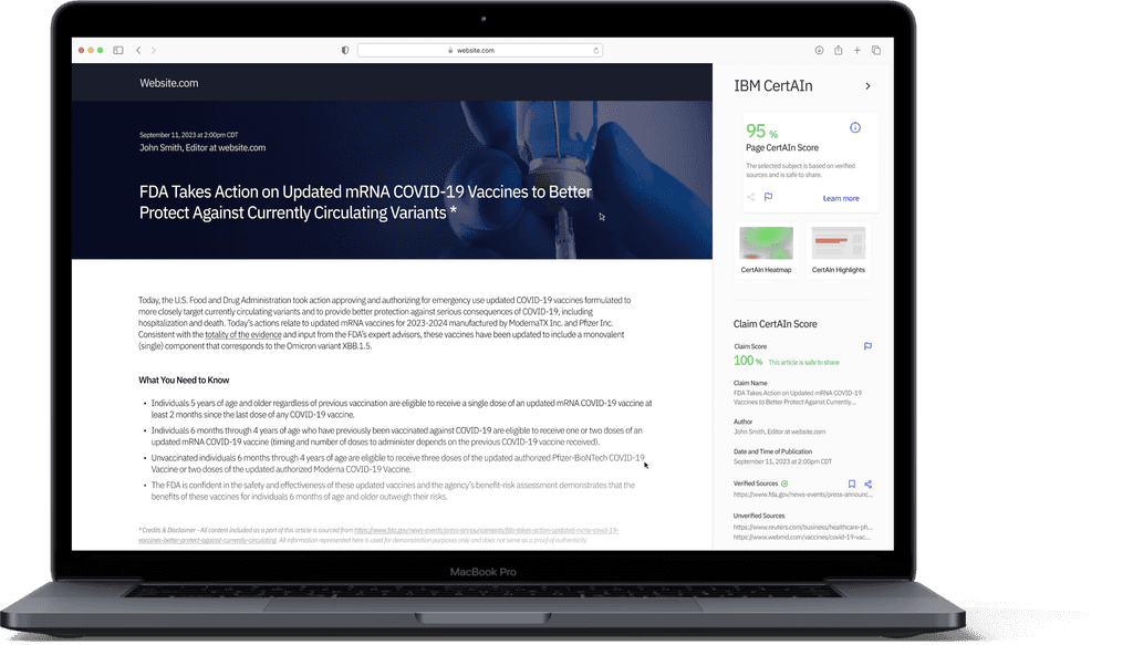
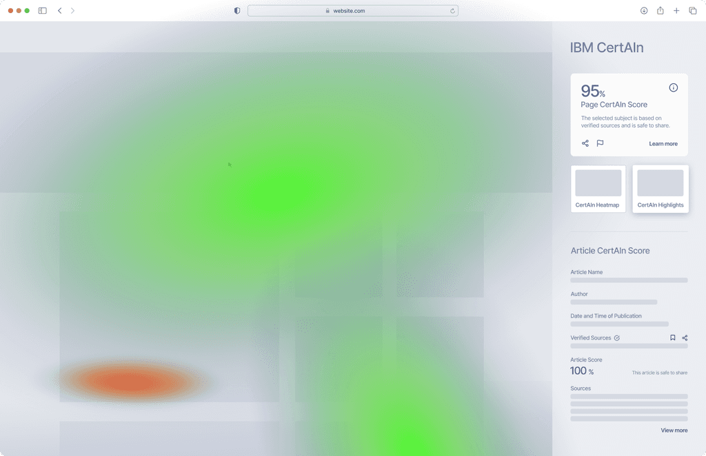
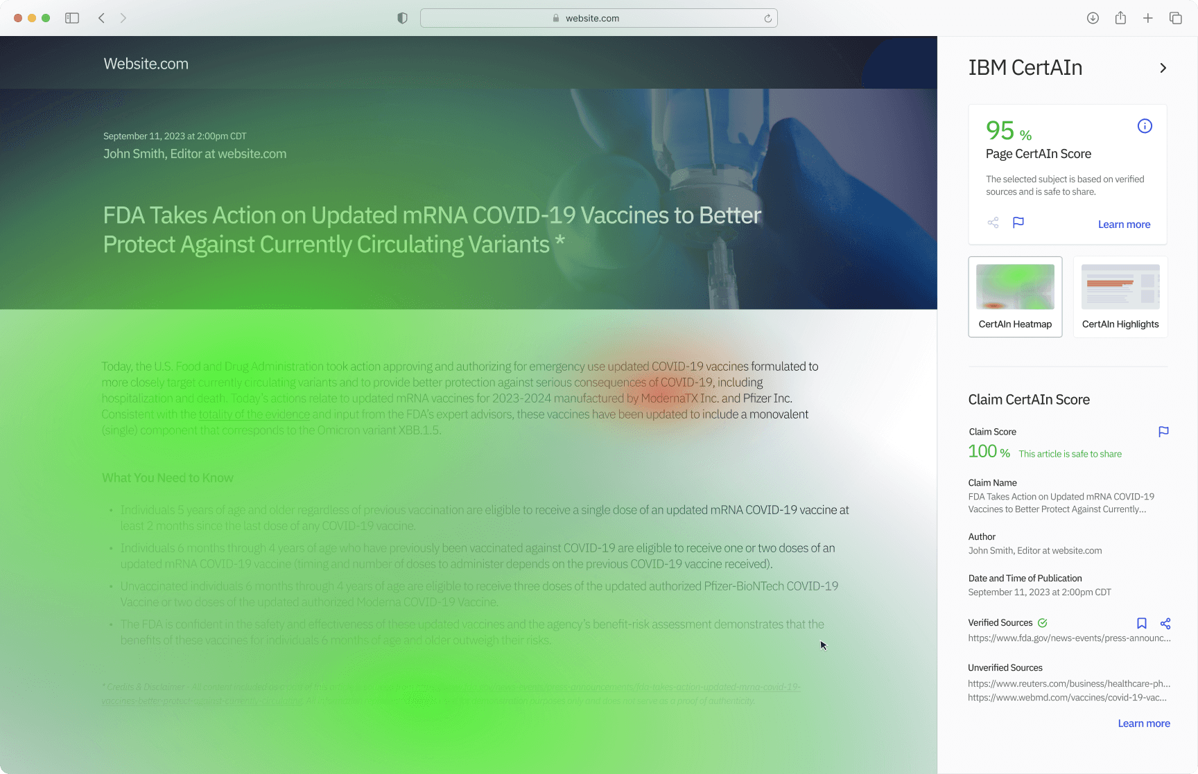
Learn what to trust: Leverage a heatmap to detect credible parts of an article with the help of AI
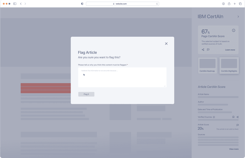
Share with others: See how safe the information is to share with your claim score.
Know your source: Learn more about the sources listed, verified, or unverified
RESEARCH
We narrowed in on user pain points and our competition
Our secondary literary research told us there were a lot of “lack of’s” within the space
Our Researcher conducted secondary literary research, and from there, I was able to develop 3 key insights.
Lack of transparency: Despite advancements with tech, there are still gaps in transparency + lack of information/sources surrounding sources, especially for those not working in selective roles/sectors.
Incentive structure = negative impact: Social rewards such as "likes" and "dislikes" can easily provide false evidence of verification, leading to higher proportions of fake news being spread
A lot of unknowns during COVID-10: With a global pandemic, people were not sure what all to trust as information continued to evolve everyday across various digital platforms.
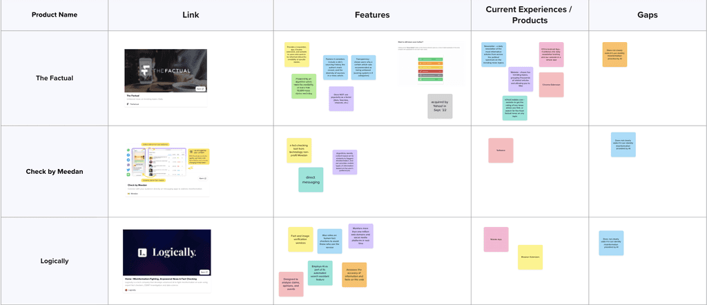
I noticed feature gaps within the market.
What I found was that most tools were made for specific sectors like national security, and some tools didn't offer a way to verify the source itself
I created the star of our show, Kathy
Based on our insights, I created our persona, Kathy- outlining her biggest goal, and her biggest pain point
Goal: Staying informed
Prioritizes staying up to date with the latest news and current events.
Relies on both web and social media to ensure she has a both comprehensive and accurate understanding of what's happening in the world.
Challenge: Information overload
Finds herself super overwhelmed with the volume of information (from what her friends forward her, to what she scans on her own)
Can't determine what information to trust, especially during a pandemic like
COVID-19
The problem we’re trying to solve
Kathy is a NYC marketing manager who needs a way to verify news on the web during a pandemic because there is an overwhelming amount of information that's constantly circulating and does not know what to trust.
WIREFRAMING
Visualizing Kathy’s journey by creating a browser extension
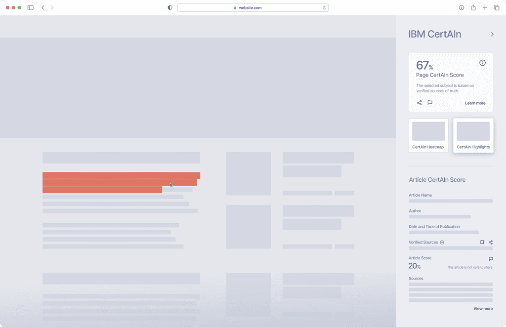
Ensuring we had a variety of views: heatmapping + highlighting
After we got out all of our thoughts in the ideation phase, our Designer created some initial wireframes to help communicate our story.
65% users preferred using a desktop view when using a heatmap
I surveyed a small group of users around their device preference. With the complex view of the data visualization via heatmap, we decided to begin with a desktop view to show its full capabilities.
FINAL SCREENS
Getting transparency in just a few clicks
Allowing Kathy to dig deep into the information she sought out
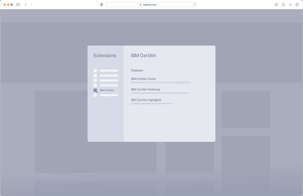
I did some quick user testing with a group of 5 people on completing tasks like enabling the extension, switching views, and most importantly, being able to determine if the article is trust-worthy.
100% of participants enabled the extension and switch views with no issue
60% of participants were able to successfully determine if the article was safe to trust.
Navigation made easy
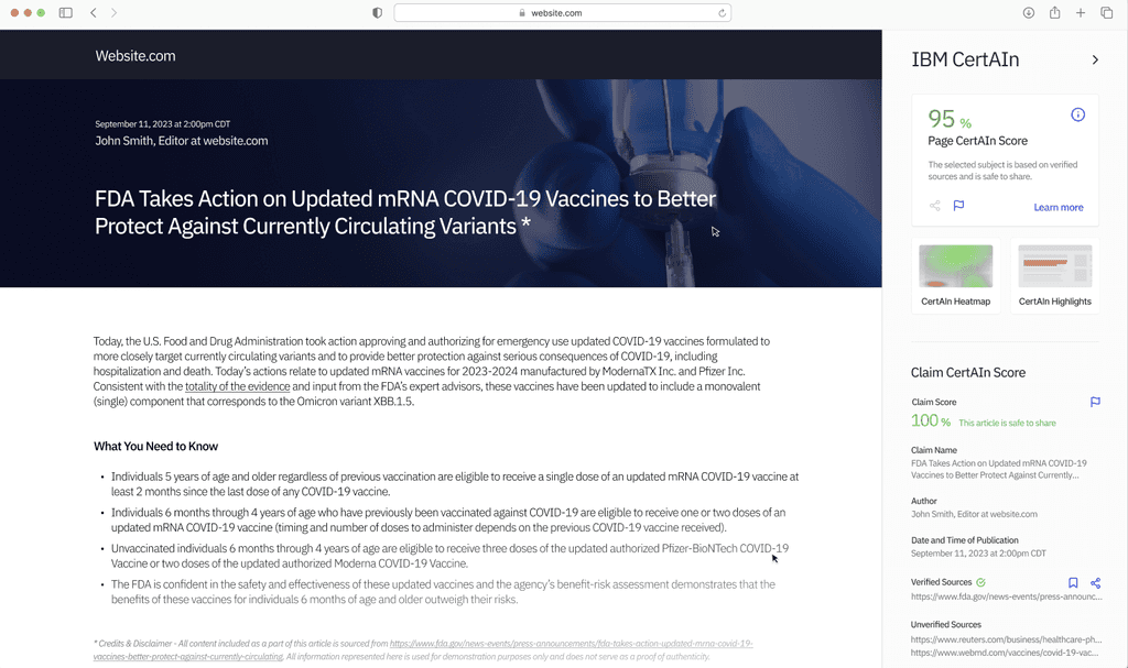
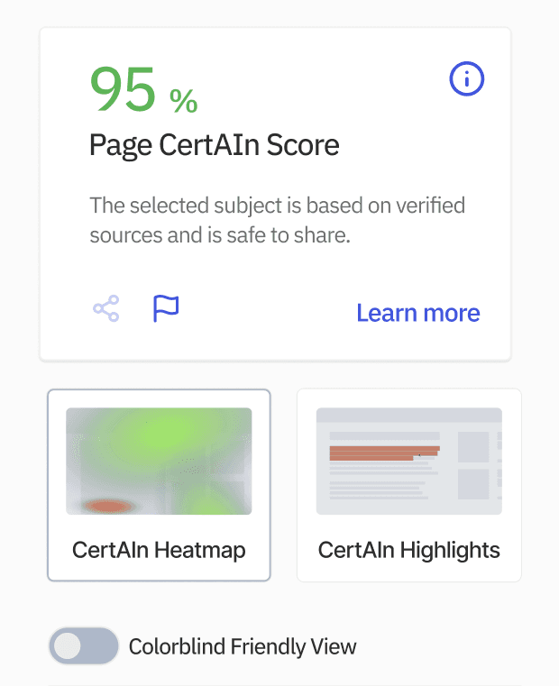
Keeping a side panel that's available to the user for easy views of sources, scores, and view switches.
High score = you can trust it
Including a CertAIn score front and center to bring the user immediate verification.
Visual consumption in different ways
Creating 2 visual methods allows the user to consume information based on personal preference.
ADDITIONAL FEATURES
Creating accessibility in V2
Making it colorblind friendly
Our group worked to get an MVP out for the Spark Design Festival, but with more time, I would have focused on making a V2 of CertAIn that would be more accessible.
I created a "Colorblind friendly" toggle on the side panel that would allow Sarato enable the preferred view, but with colors that were colorblind friendly
LEARNINGS
What I learned after we won 3rd place
Define your must have features first
It's easy to get wild with what features you'd like to add to your final product. But through the process I learned that it's okay to start with the must haves (especially during a challenge with a shorter timeline. Then as you test and iterate, adding in the nice to have features is the next move.
