I transformed IBM research studies into valuable insights
My Role
Lead UX Designer
Timeline
4 weeks
Team
1 UX Designers
1 Researcher
1 Content Designer
2 Developes
My contributions
Research sysnthesis
Ideation
Prototyping
Context
As a UX designer at IBM, I redesigned the IBM User Insights Hub (UIH), an internal platform for sharing and tracking UX research insights.
The goal was to increase adoption rates and empower researchers and product managers to access, share, and leverage insights seamlessly.
PROBLEM
How might we make it more concise and easy to scan?
With researchers and product managers generating a lot of information + data from their work, it becomes a challenge to house all of that in a trackable way.
RESEARCH
They didn’t like it
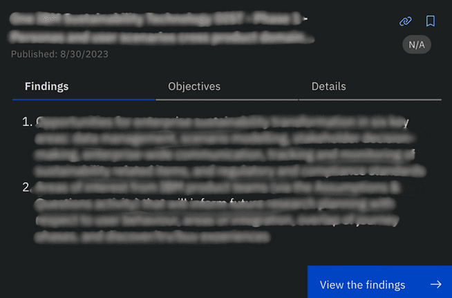
Our researcher on the team held a workshop with some of the project managers and researchers (our primary user group), and some key pain points were uncovered. (*Confidential information has been blurred out in image*)
"The text is SO dense, it's hard to read"
"Not sure about the hierarchy or relationship between these headers?"
"This doesn't feel like I can really easily scan the card"
DEFINE
3 key pieces to the goal
After some affinity mapping, I identified 3 themes/goals that we’d tackle when designing
Readability & Hierarchy: Establish a clear and consistent structure.
Clean Layout: Improve visual organization to make the page feel lighter.
Content Gaps: Ensure key information is surfaced effectively.
IDEATION
Gotta start with Crazy 8’s (or 3’s)
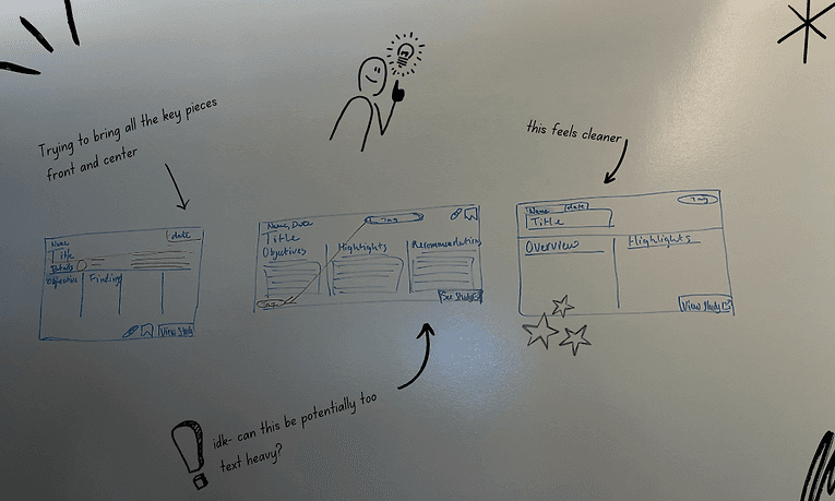
My teammate Leo and I got to sketching out multiple approaches. Initially, we tried fitting everything onto one frame but realized the volume of content would need a more tabular structure.
FEEDBACK
From "uh-oh" to an opportunity
I created various iterations for the team, and in our playback sessions, I learned that researchers had far more findings than expected—100+ insights instead of 3-5 per study (like we designed for). Our initial designs couldn’t accommodate this scale.
ITERATION (again)
An immediate learning, always clarify constraints
I created a feedback grid to determine our next move and to hone in on hey constraints we needed to design around. Our iterations told that a table based solution was needed in order for our users to be able to efficiently search + filter through the findings.
FINAL SCREENS
Surface the key parts to the front
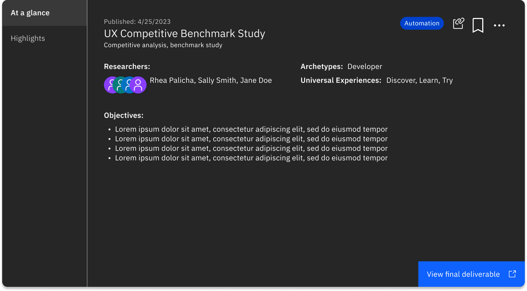
Based on stakeholder feedback, we wanted to surface the key details to the cover/face of the card, allowing the user to quickly scan high level pieces of the research study (the who, what, and how)
Make it simple to scan
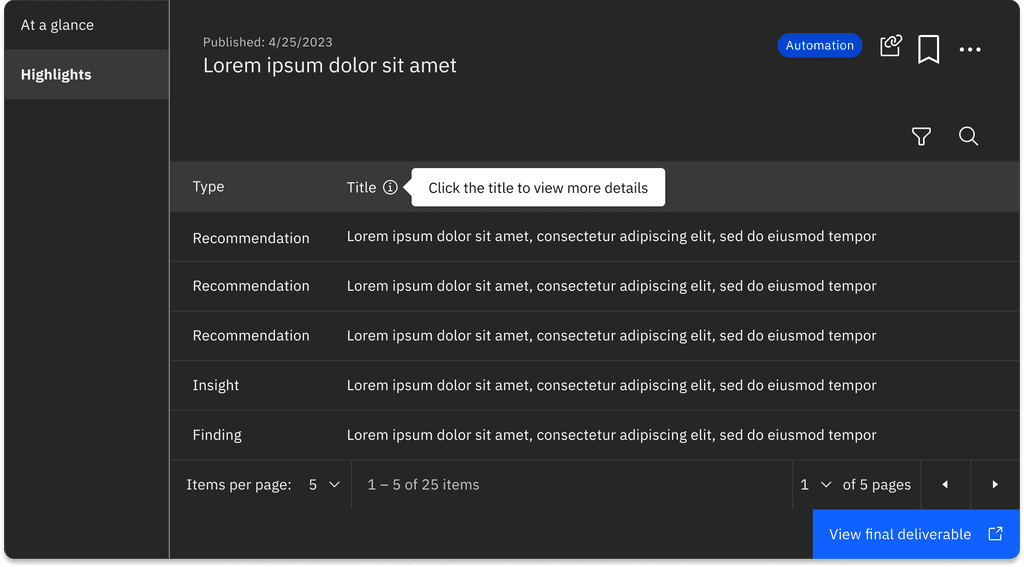
When we saw how many research outputs there were, we determined that a table format was our best solution, creating a clean way for the user to search and filter findings accordingly.
LEARNINGS
2 key learnings
While the team ultimately took a different direction and went with a different design, I'm grateful for the experience in design systems, design decisions, and showcasing my skill. Other key learnings included:
Clarify early: Misalignment with stakeholders cost valuable time. Establishing clear expectations upfront ensures smoother execution.
Design for Scale: Always account for the potential growth of content when creating systems.


