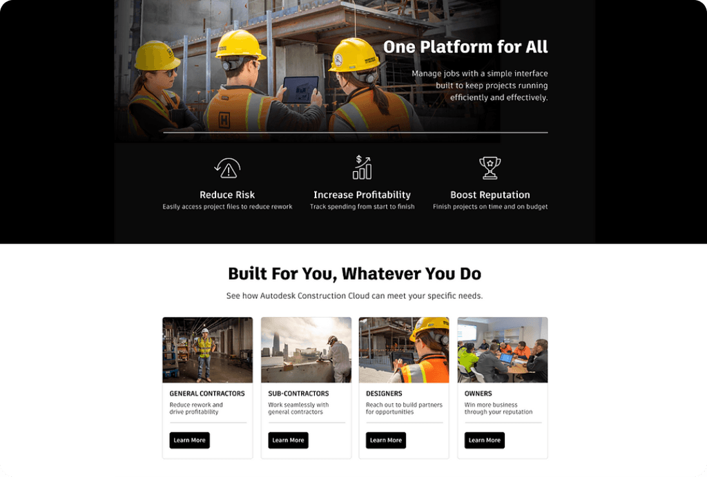
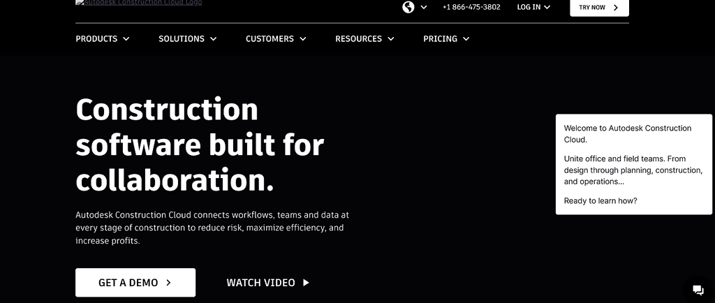
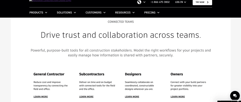
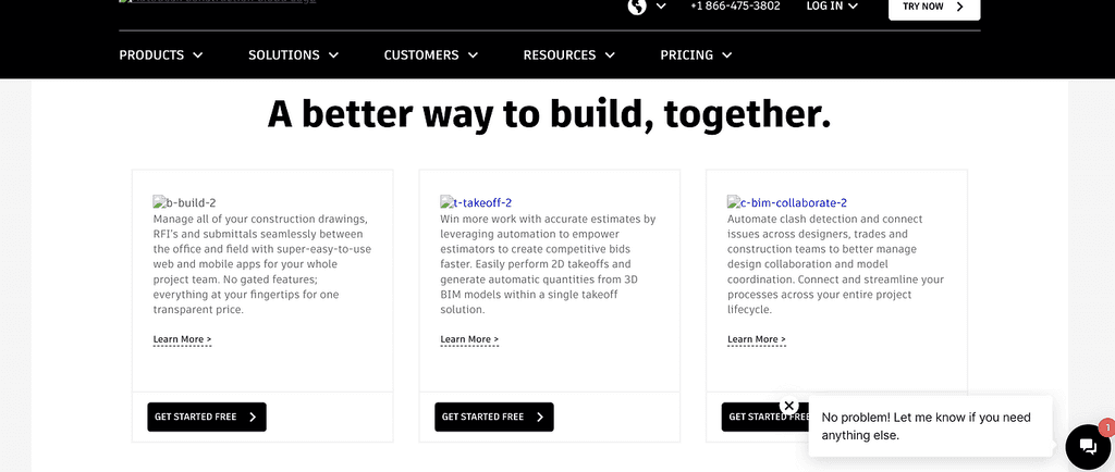
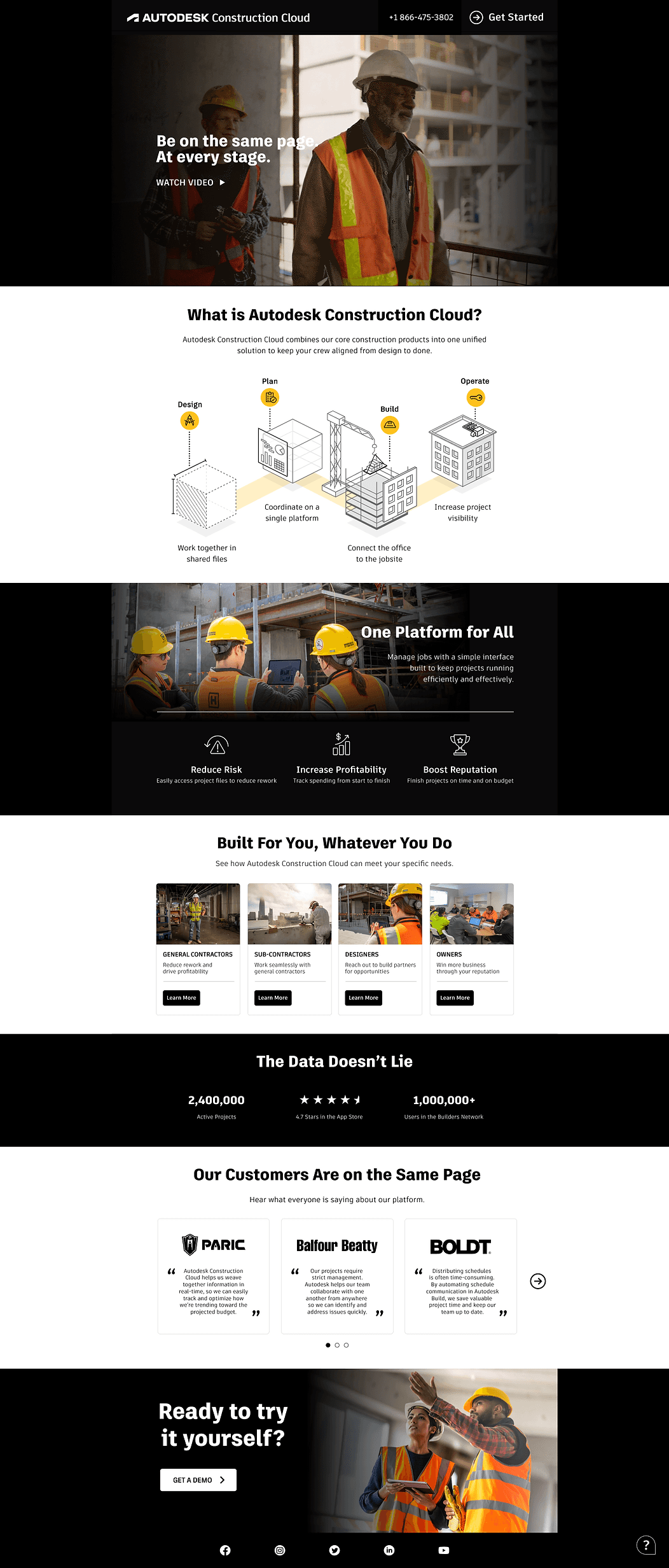
I led the redesign of Autodesk’s landing page to improve learnability
My Role
Lead UX Designer
Timeline
6 weeks
Team
1 Client Executive
2 Developers
My contributions
Research
UX Strategy
Journey Mapping
Project overview
Autodesk, a leader in 3D design and engineering, and our client, launched a new product in 2022, Autodesk Construction Cloud, a solution that allows project teams to collaborate securely and quickly, so that they can deliver projects on time and on budget.
Using my marketing + design fused background, I led the redesign of the landing page.
PROBLEM
The page fell short of both business and user expectations
No demo clicks meant a missed opportunity to potentially generate high qualified leads
Lack of a clear story failed to clearly communicate the product’s value prop
SOLUTION
Making it simple to understand the narrative
I redesigned the landing page to better communicate the value of the product, and provided clear and actionable ways for contractors, designers, and project owners to engage and explore ACC’s potential.
STAKEHOLDER ALIGNMENT
The crossover in goals: Unified storytelling for engagement
I met with key stakeholders from the Autodesk team to align on overall goals, both from a design and business point of view
Biz goal: Position ACC as a leading solution by effectively communicating its value prop + driving user engagement
Design goal: Create a visually compelling page that simplifies navigation, enhances learnability, and tells a cohesive story.
RESEARCH
It was giving wireframe
(See below)
Unfortunately, Autodesk didn't allow us to conduct user interviews with some of their users, so I conducted a site audit of the current experience. Key findings included:
Visual weakness: Position ACC as a leading solution by effectively communicating its value prop + driving user engagement
Fragmented messaging: Create a visually compelling page that simplifies navigation, enhances learnability, and tells a cohesive story.
No street cred: Create a visually compelling page that simplifies navigation, enhances learnability, and tells a cohesive story.
IDEATION & WIREFRAMING
Crafting the right narrative
Using my insights from research and competitive analysis, I designed a narrative framework and brought that to life through initial sketches and a wireframe (made by another creative)
The What: Clearly define what ACC is and its primary purpose
The Who: Highlight the target audiences to ensure relevance.
The How: Display features and functionality in a visually digestible format
The Why: Build credibility with client testimonials and trust
PROTOTYPING AND TESTING
I recommended an A/B test before launch
After receiving feedback from ACC stakeholders, the wireframes and framework were handed over to their visual design + dev teams. After delivery of final screens, I recommended A/B testing around CTA writing (“Watch video VS Watch Demo)
Why? I had an hunch that demo gave a more clear preview of what users could expect.
OUTCOME
Happy results, happy client
Post 1 month launch, the Autodesk team saw a 20% in demo clicks. The reason why? The right storytelling created the right experience, which then prompted users to stay engaged, and want to learn more.
LEARNINGS
I learned how to turn my background into a superpower.
Don’t be afraid to fuse my dual expertise: Combining my marketing and design backgrounds helped me to see the journey from a different pov, and create a more compelling narrative.
Clarity drives results:
A shared vision between business stakeholders and designer ensures alignment on what we’re working towards
